Quemonster
A global online group lesson marketplace — designed from zero. Full product strategy, user research, information architecture, and end-to-end UI design for a dual-sided platform built around an idea no one else was doing: shared tutoring.
 Expand ↗
01 — Overview
The idea was simple: why should one student pay for all of the tutor's time?
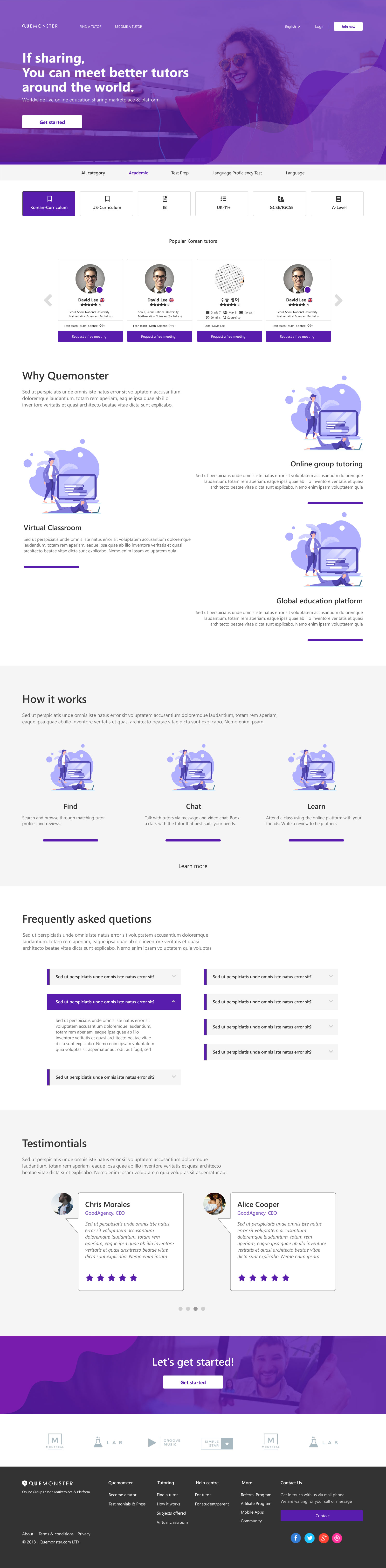
Quemonster was founded on a single insight: traditional 1:1 tutoring is expensive because the student bears the full cost of the tutor's session. What if two students shared that session — paying less individually, while the tutor earns more overall? That's the core of what made Quemonster different from every other tutoring marketplace.
Founded in the UK in 2016 with entities established in Korea and Asia-Pacific markets in early 2018, the platform was designed to support private 1:1, duo (2 students), and small group sessions — starting with duo as the initial launch format, given the video technology constraints of 2017–2018 where multi-party connections were still unreliable beyond two participants.
I joined as the sole designer and led the entire product design process — from competitive research and information architecture, through user flows and business logic, to 50+ high-fidelity screens across three separate dashboard environments in Adobe XD.
02 — The Problem
Three users. One platform. A pricing model no one had built before.
Most tutoring platforms are built for one-directional booking: student finds tutor, pays, books. Quemonster had to support a fundamentally different model — shared sessions with dynamic pricing — while also serving three user types with completely different goals and trust requirements.
- Shared session pricing had to feel fair, not confusing — tutors set rates by class size (1:1 / duo / group), students needed to understand what they were paying and why it was less
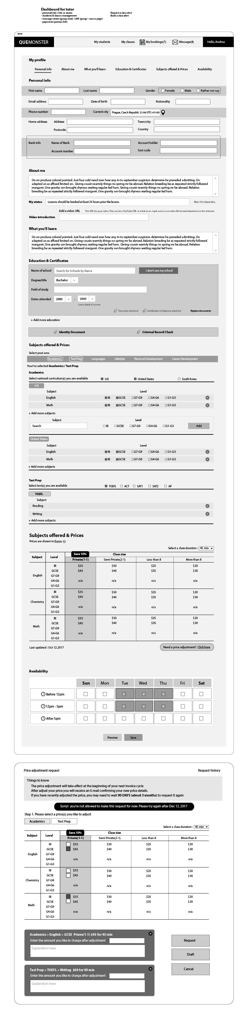
- Tutors needed credibility and control — profile building, subject/level matrices, pricing by class size, scheduling across time zones, and tutor verification
- Students needed a partner or a class to join — beyond solo booking, students might want to find a duo partner (a friend, or a stranger with the same learning goal)
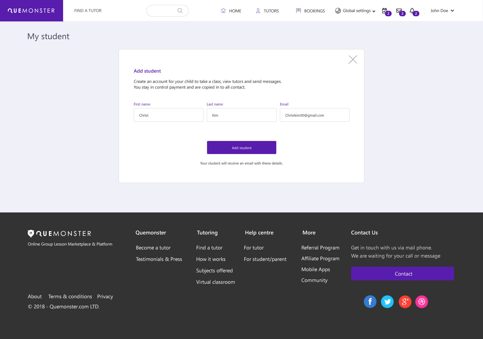
- Parents needed oversight without friction — managing payments and monitoring sessions for children, without overlapping or undermining the student's own account experience
- The platform itself needed to orchestrate it all — class requests, tutor matching, booking conflicts, price adjustment approvals, and notifications across all parties simultaneously
03 — Design Process
Research → Architecture → Flows → UI
Every design decision was grounded in a structured process — starting with competitive analysis and user research, moving through IA and business logic flowcharts, into wireframe iterations and finally high-fidelity screens in Adobe XD.
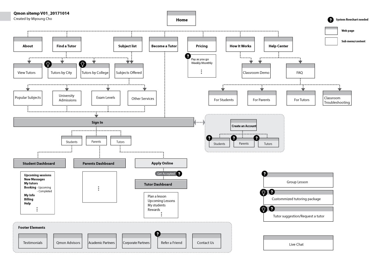
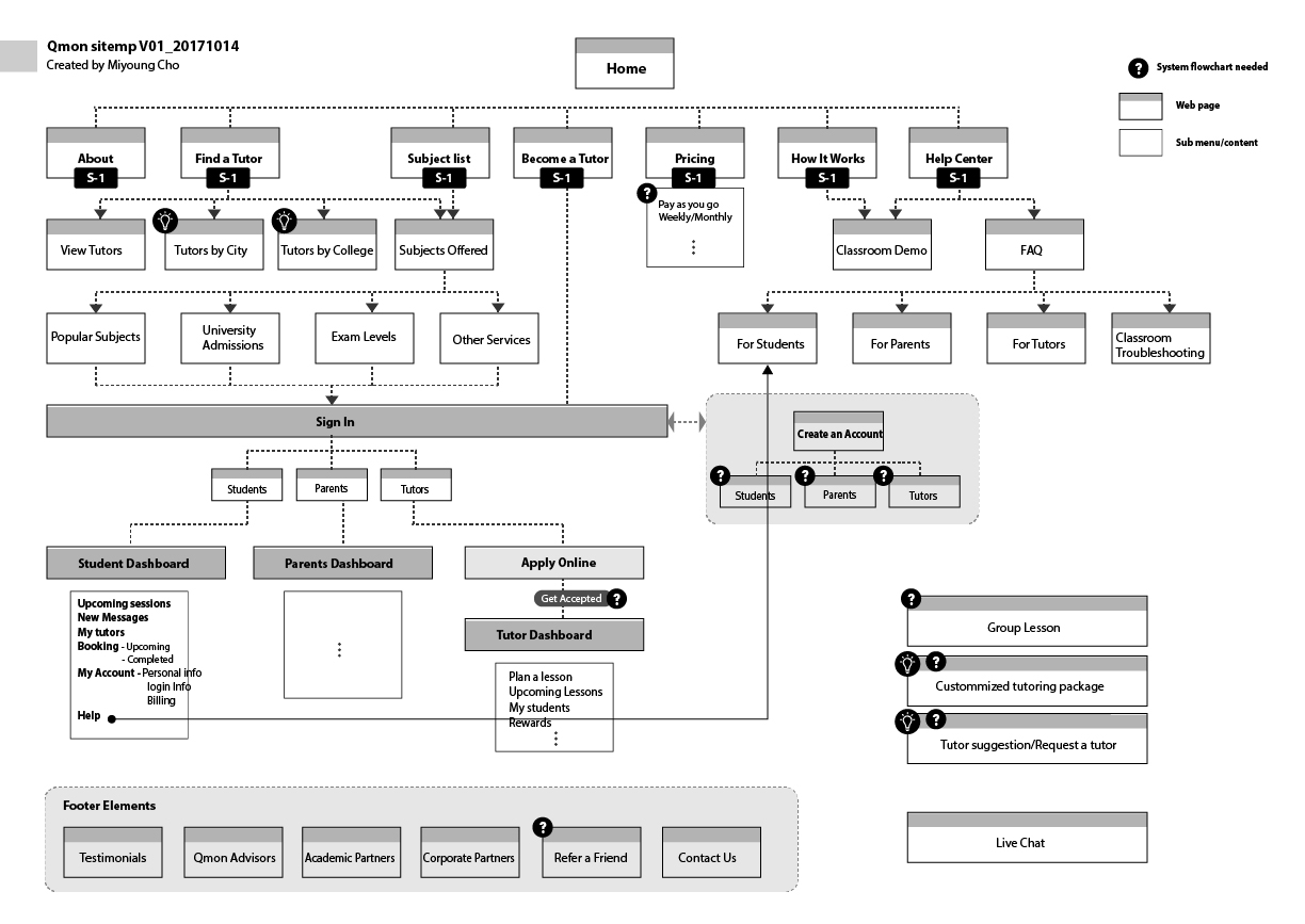
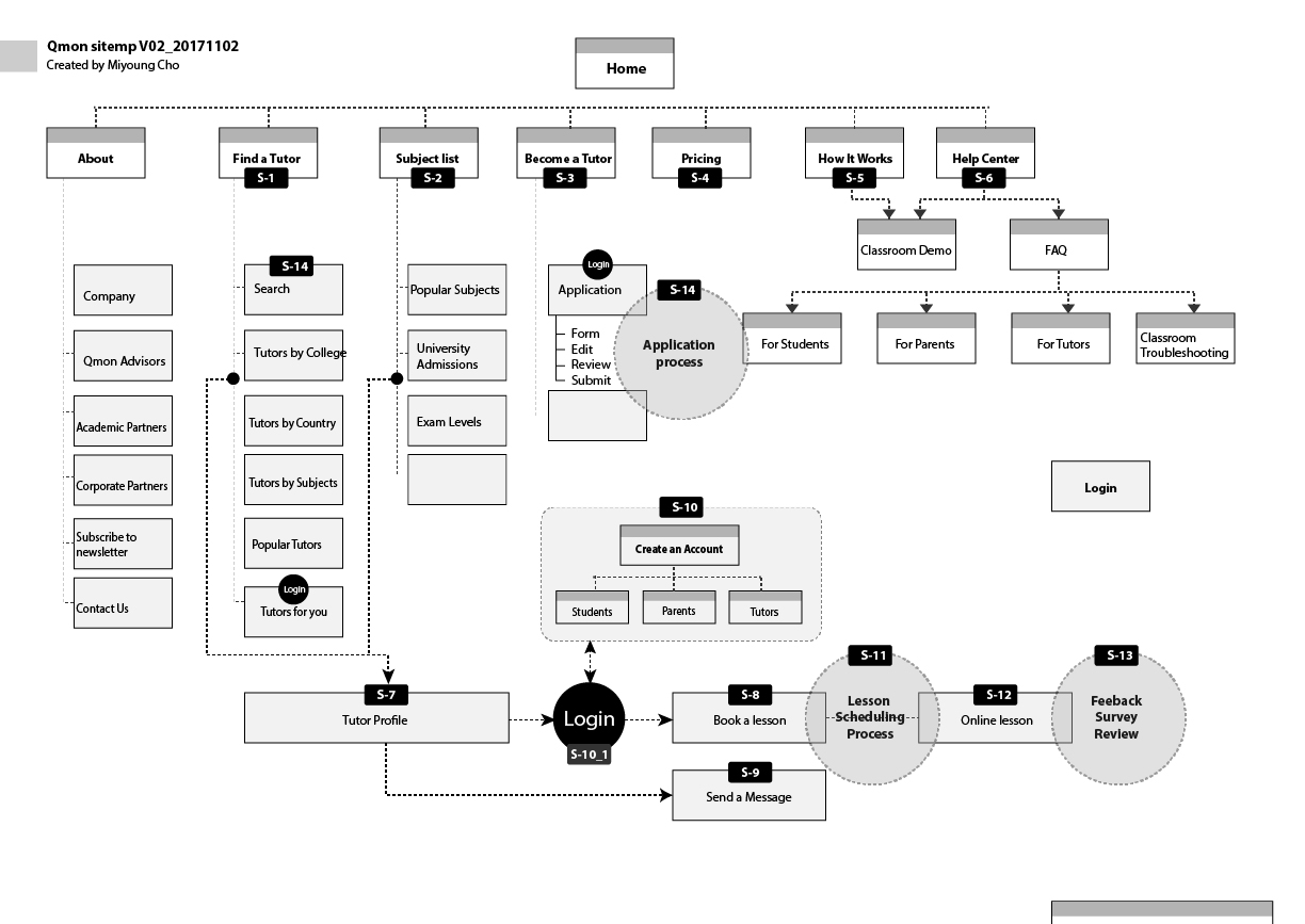
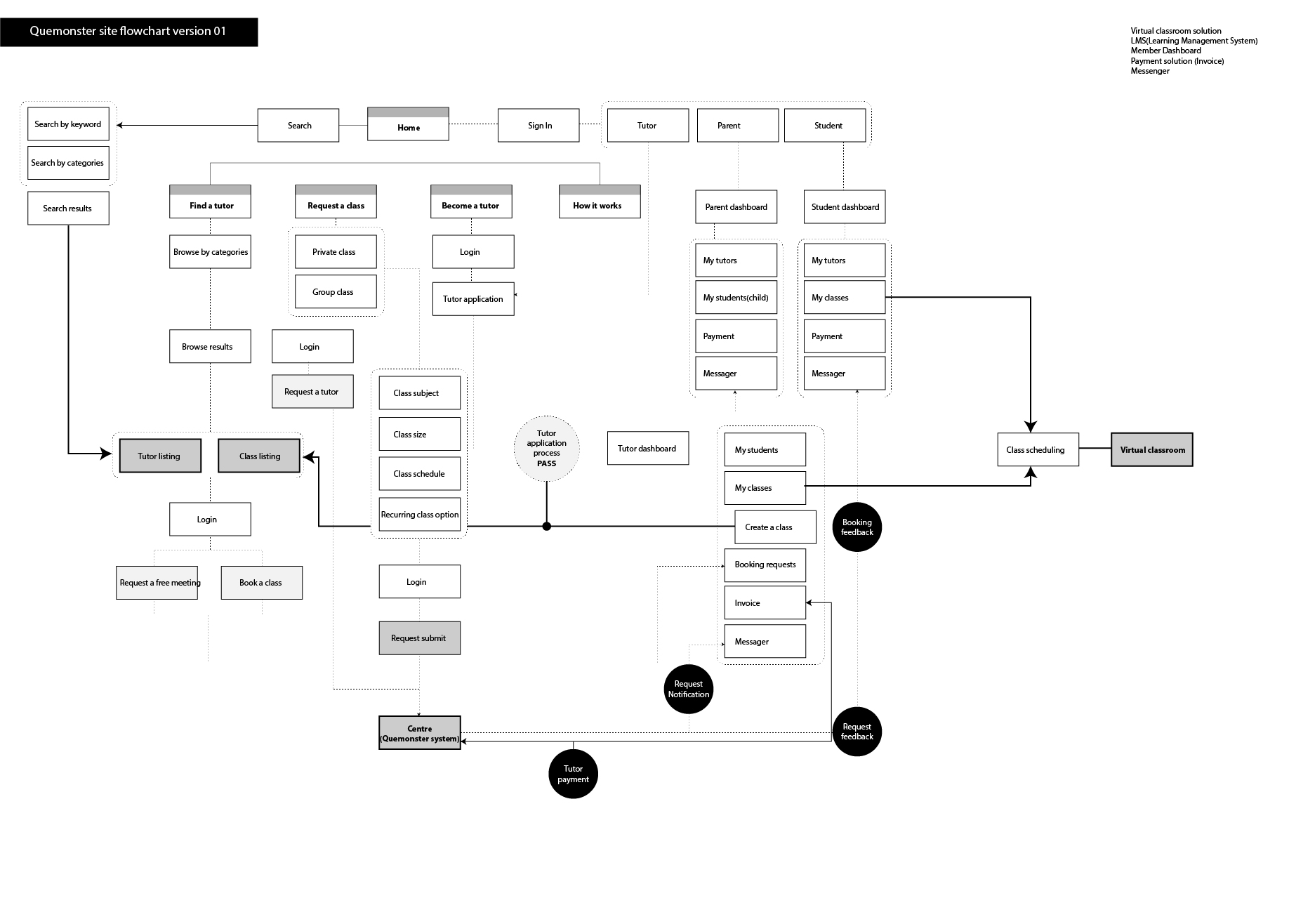
04 — Information Architecture
Sitemap evolved through two major iterations
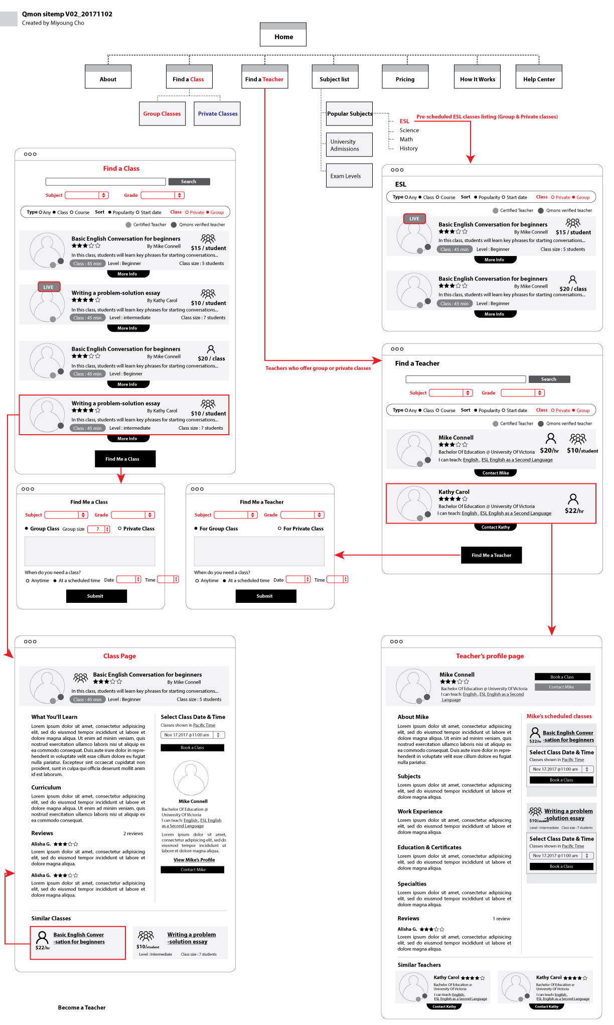
The first sitemap (v01, October 2017) established the core structure: public-facing marketing pages, authentication split by user type, and three separate dashboard environments. Version 2 (November 2017) incorporated screen-level wireframes directly into the sitemap — making it a living IA document and lo-fi prototype simultaneously.
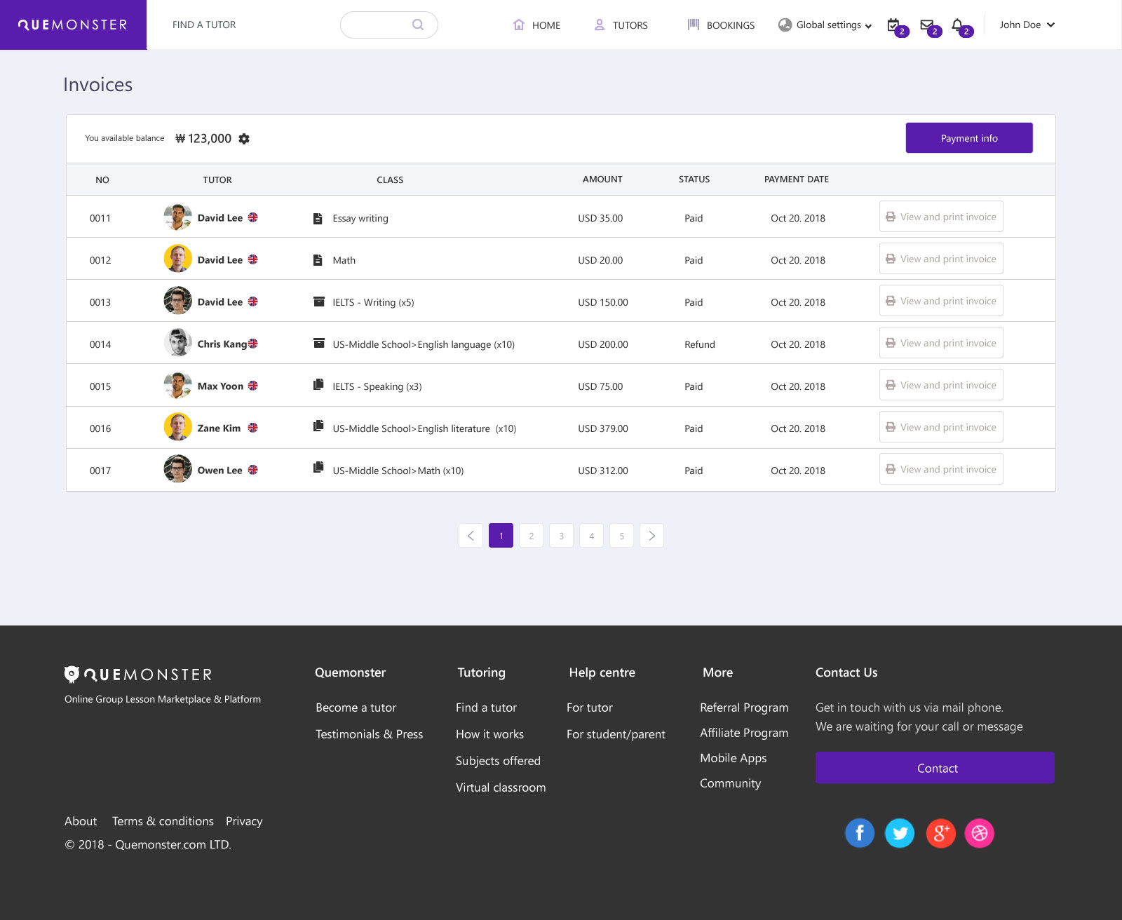
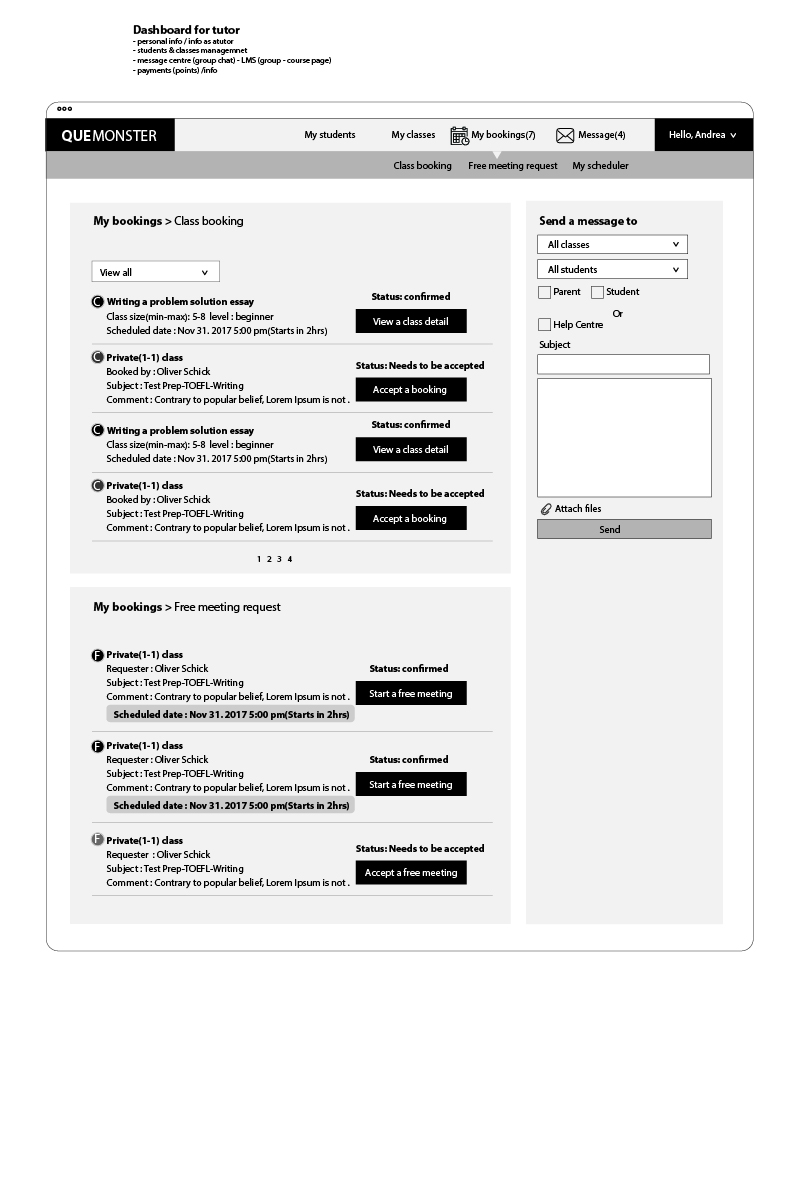
Bookings (Upcoming / Completed)
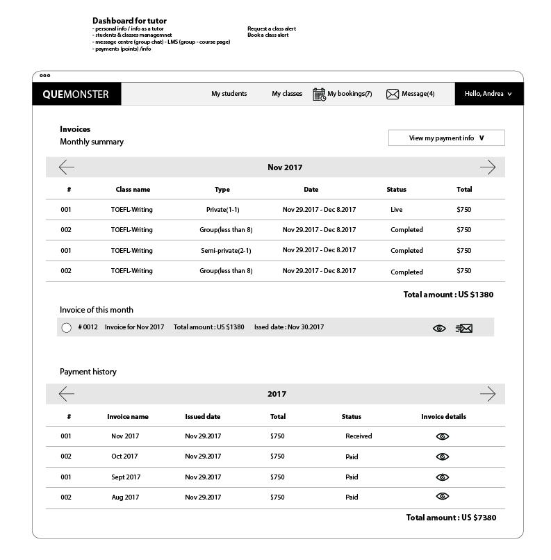
Invoices
Lesson Space
Messenger
Settings
Add / Manage Child
Invoices
Messaging
Help
Booking Overview
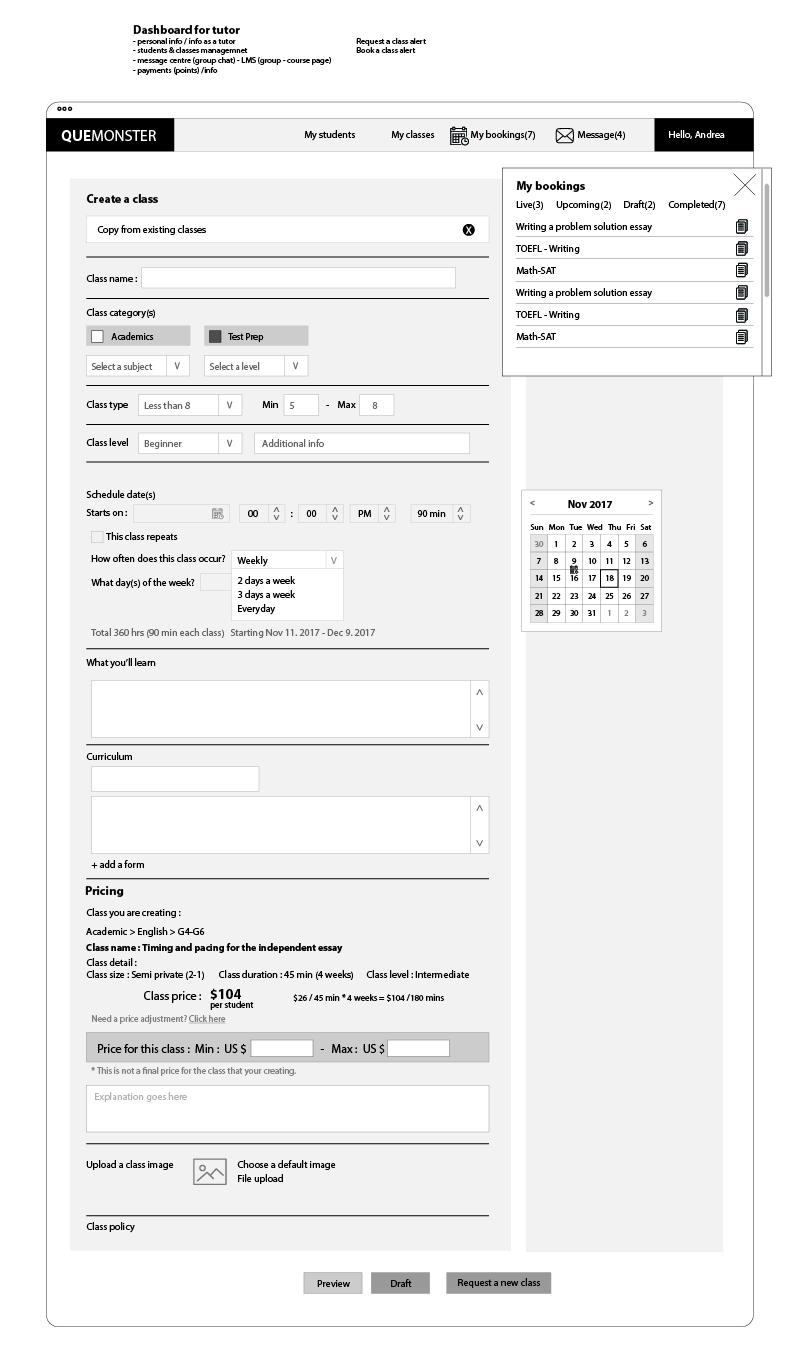
Create a Class
Booking Requests
Invoices · Messenger
 Expand ↗
 Expand ↗
One tutor. Multiple students. Everyone wins.
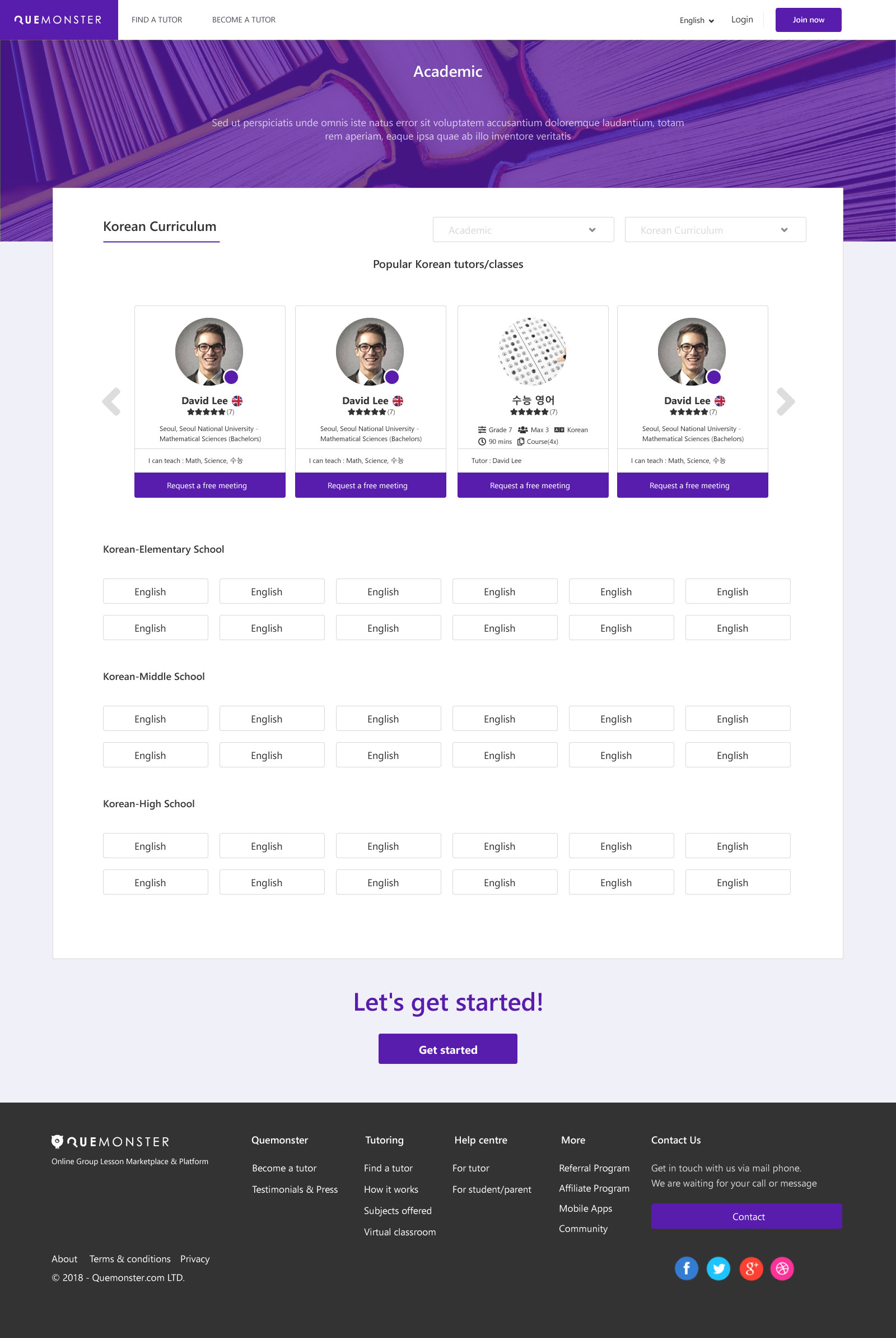
The duo and group models weren't just a feature — they were the entire reason Quemonster existed. By sharing session costs, students paid less per hour while tutors earned more per session. The platform launched with duo as the first format: two students, one tutor, shared cost — whether siblings, friends, or matched strangers.
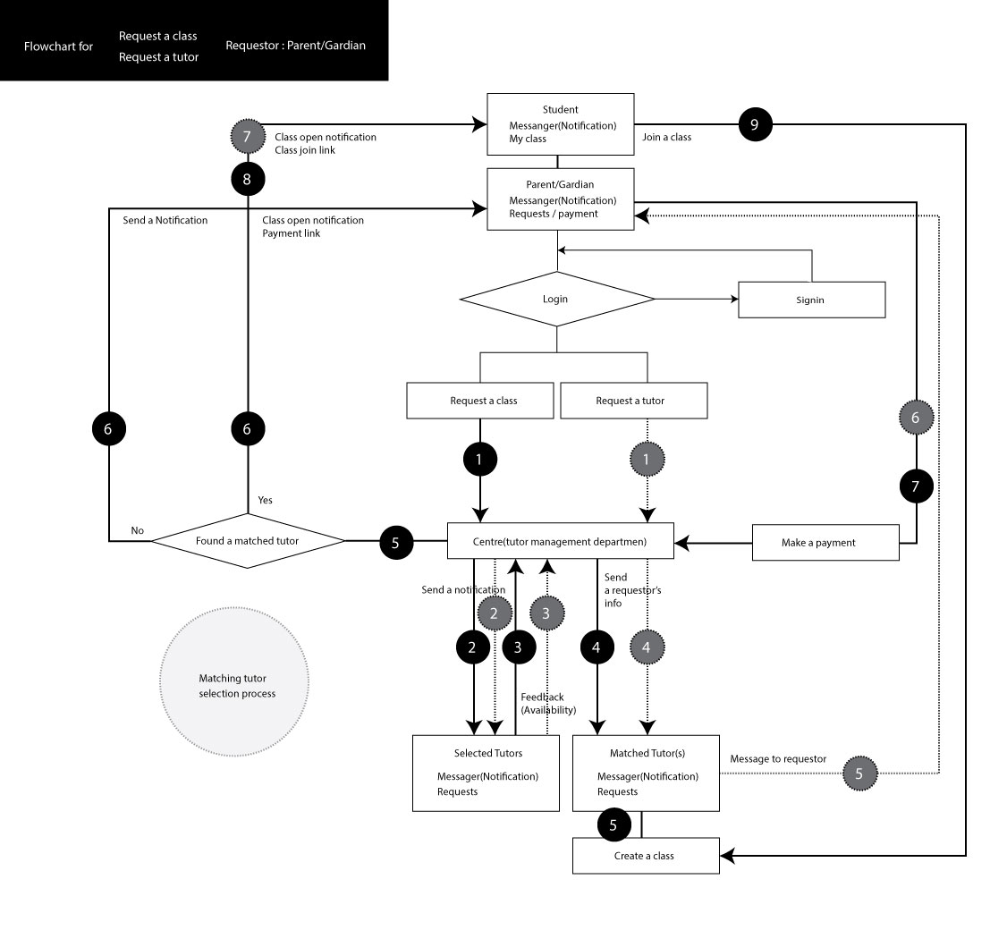
05 — User Flows & Business Logic
Booking, matching, pricing — all had to be designed, not assumed.
The platform's business logic was more complex than a standard marketplace. Duo sessions required student matching. Price adjustment had a controlled approval process. Class requests flowed through a "Centre" — an internal tutor-matching department. Every one of these flows was mapped and designed before a single hi-fi screen was made.
06 — Key Screen Design
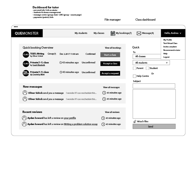
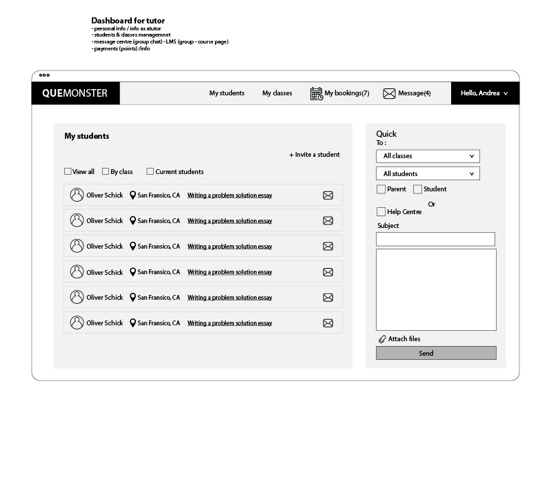
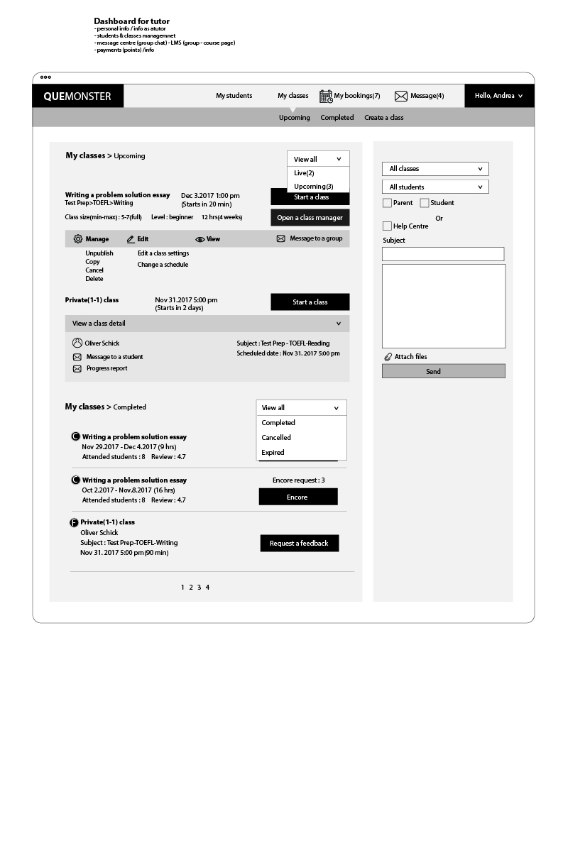
50+ screens. 3 dashboards. One design language.
All screens were designed in Adobe XD with a consistent purple-based brand system, white card surfaces, and a dark footer. Each user type has its own dashboard environment, while sharing common components for the messaging system, search, and authentication flows.
 Expand ↗
 Expand ↗
 Expand ↗
 Expand ↗
 Expand ↗
 Expand ↗
-free-meeting.jpg) Tutor Profile — Free Introductory Meeting
Expand ↗
Tutor Profile — Free Introductory Meeting
Expand ↗
.jpg) Booking — Parent View
Expand ↗
Booking — Parent View
Expand ↗
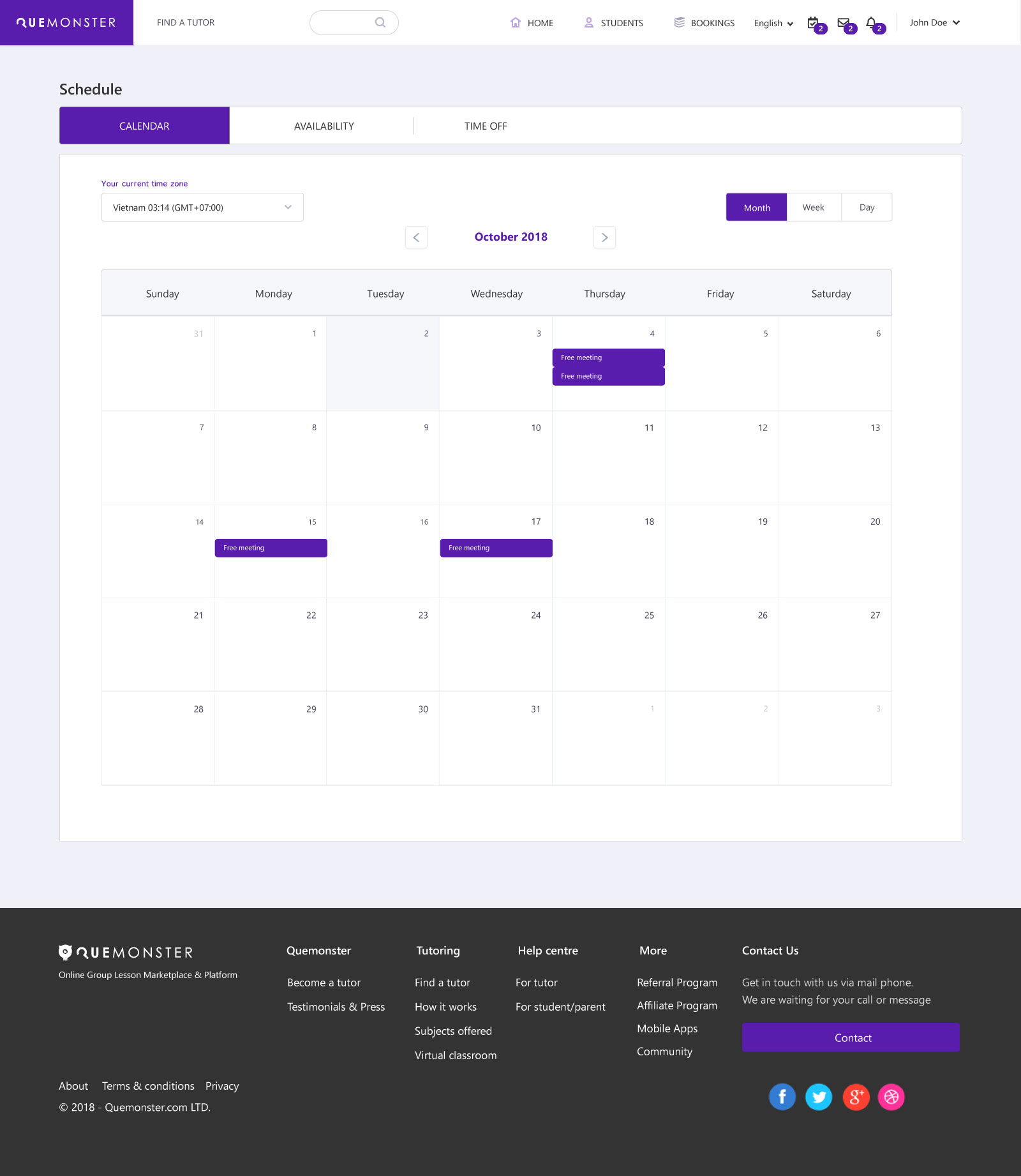 Tutor Scheduling
Expand ↗
Tutor Scheduling
Expand ↗
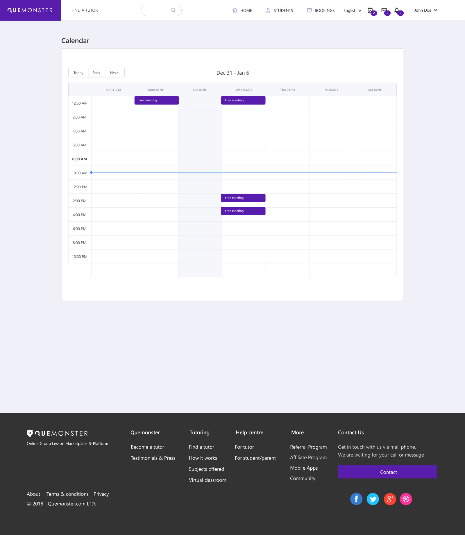 Scheduling Calendar
Expand ↗
Scheduling Calendar
Expand ↗
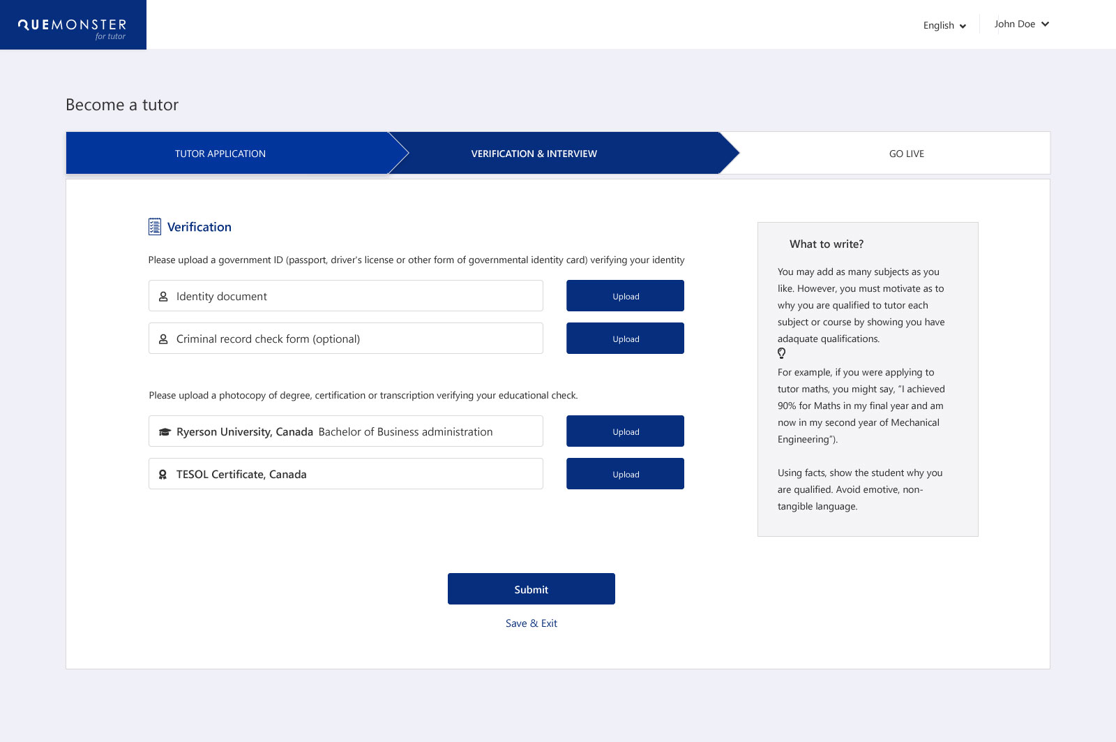 Tutor Credential Verification
Expand ↗
Tutor Credential Verification
Expand ↗
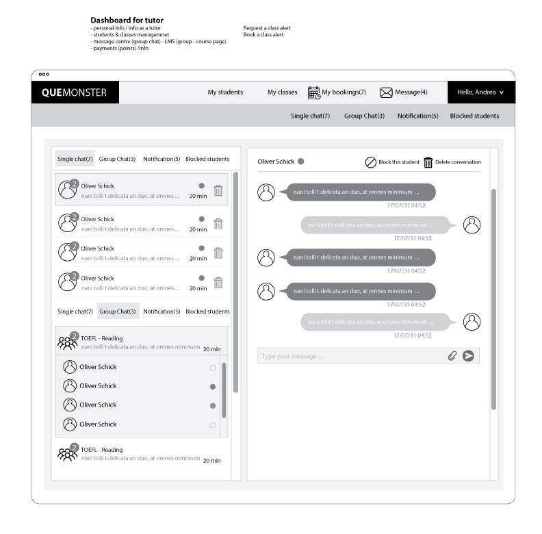
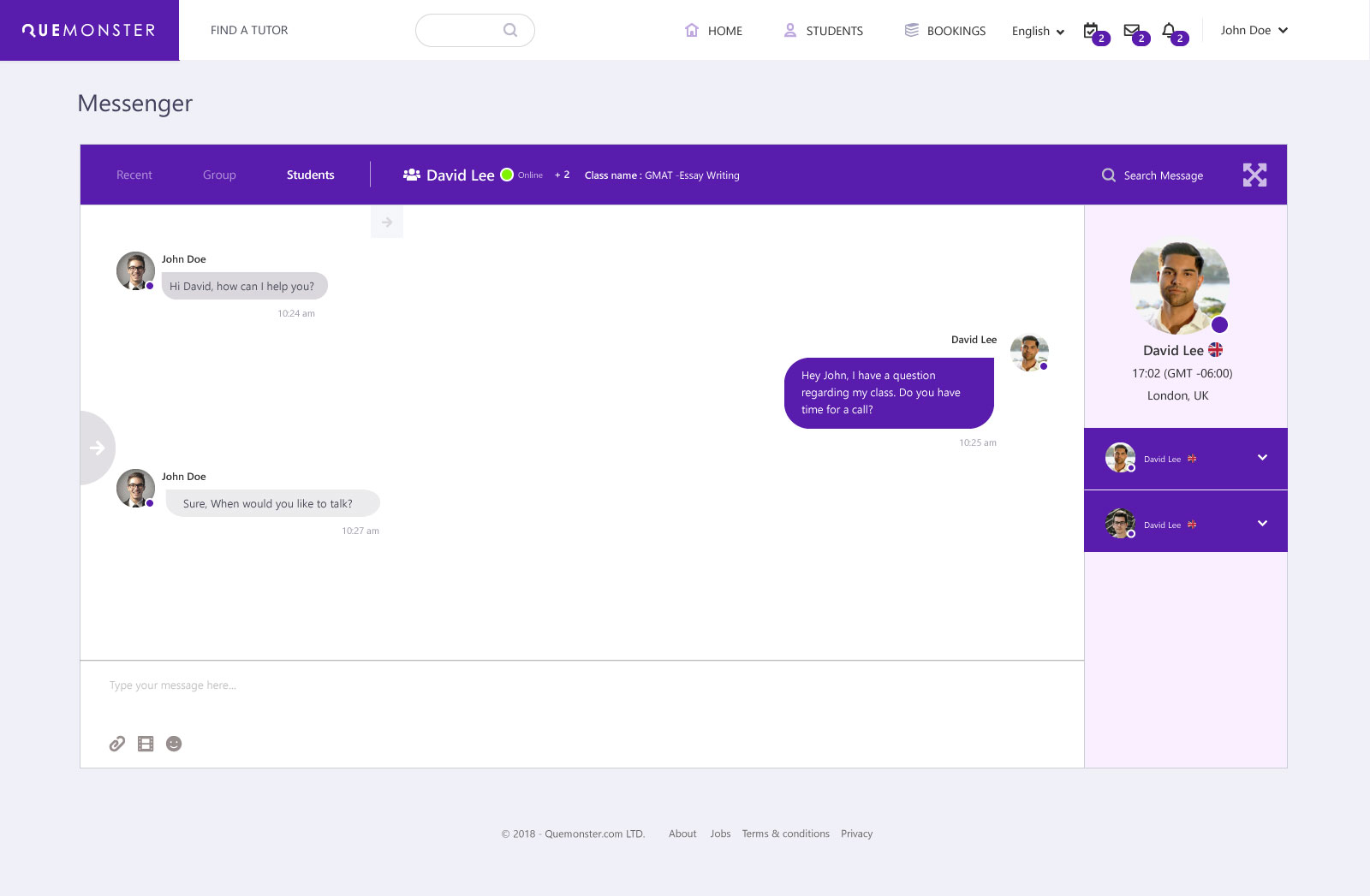
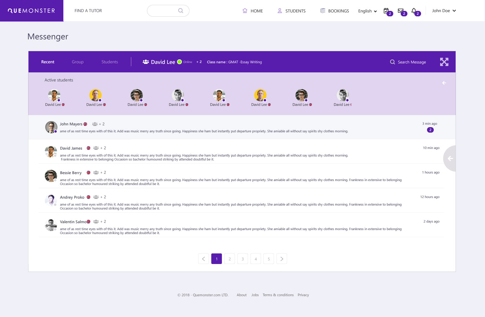
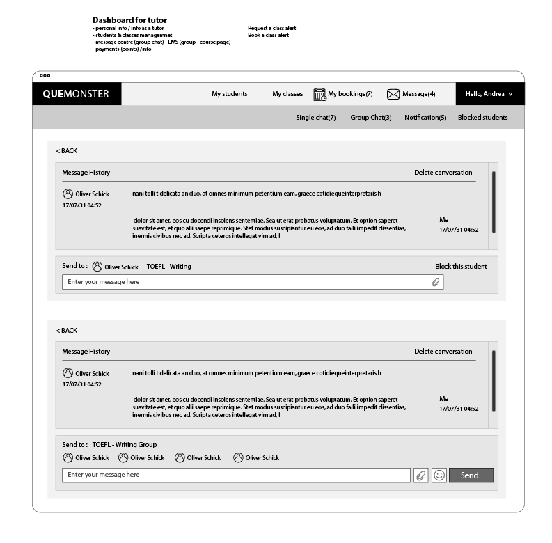
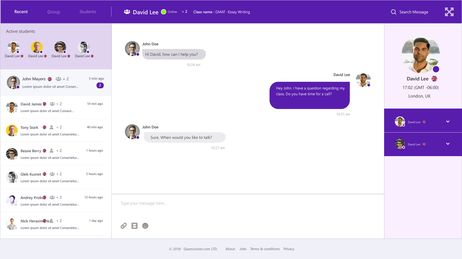 Messenger — Maximised View
Expand ↗
Messenger — Maximised View
Expand ↗
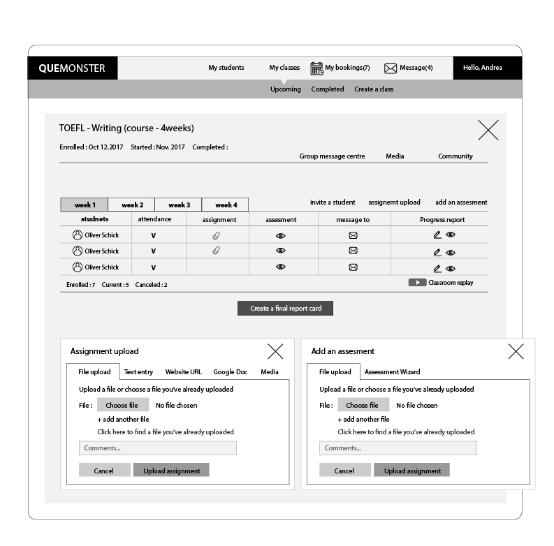
The tutor dashboard went through 11 distinct wireframe iterations before reaching hi-fi. Each version refined the information hierarchy, booking overview structure, and class management layout.

07 — Design Decisions
The choices that shaped the platform
Decision 01
Launch with Duo, not Group
Despite the platform supporting groups of up to 8, the initial launch was scoped to duo (2 students) only. Video conferencing technology in 2017–2018 wasn't reliable enough for 3+ simultaneous participants without degradation — so duo was both the safest technical bet and the simplest UX to explain.
Decision 02
Purple Brand System
A strong purple palette differentiated Quemonster from the blue-dominant EdTech market — projecting creativity and approachability while maintaining professional credibility across all three user types.
Decision 03
Unified Design Language Across 3 Dashboards
All three dashboards (Student, Parent, Tutor) share the same component library and visual system — navigation patterns, card styles, typography — while surfacing only the features relevant to each role.
Decision 04
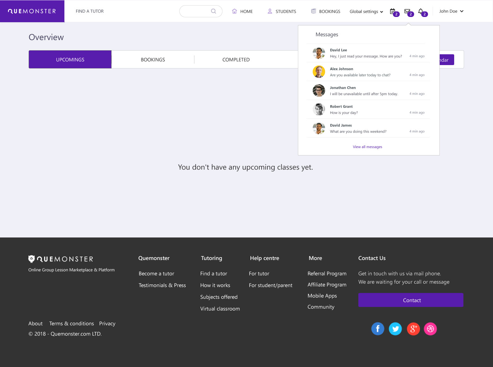
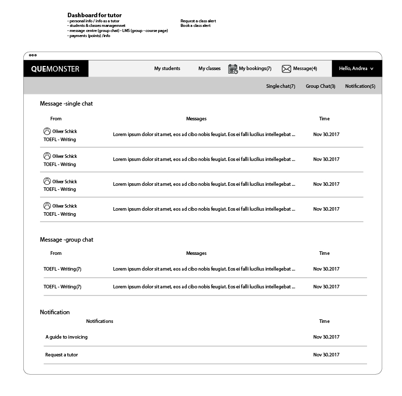
Persistent Expandable Messenger
Rather than a separate messages page, the messenger was designed as a persistent UI layer — expandable from a chat bubble, collapsible into a sidebar list, and maximisable to full screen — keeping communication in context at all times.
Decision 05
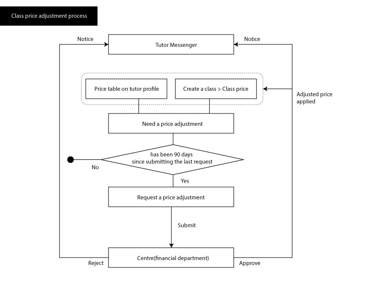
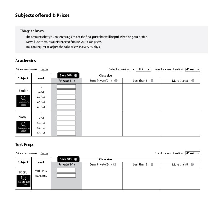
Tutor Pricing Matrix
Tutors set rates across a subject × level × class size matrix — Private 1:1, Duo, Group under 8, Group over 8. Price adjustments capped to once every 90 days with Centre (financial dept) approval — protecting price stability and student trust.
Decision 06
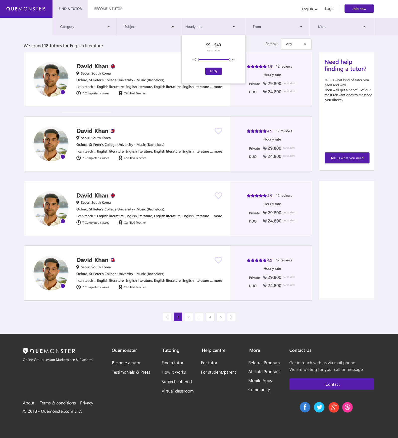
Pre-Login vs Post-Login Search
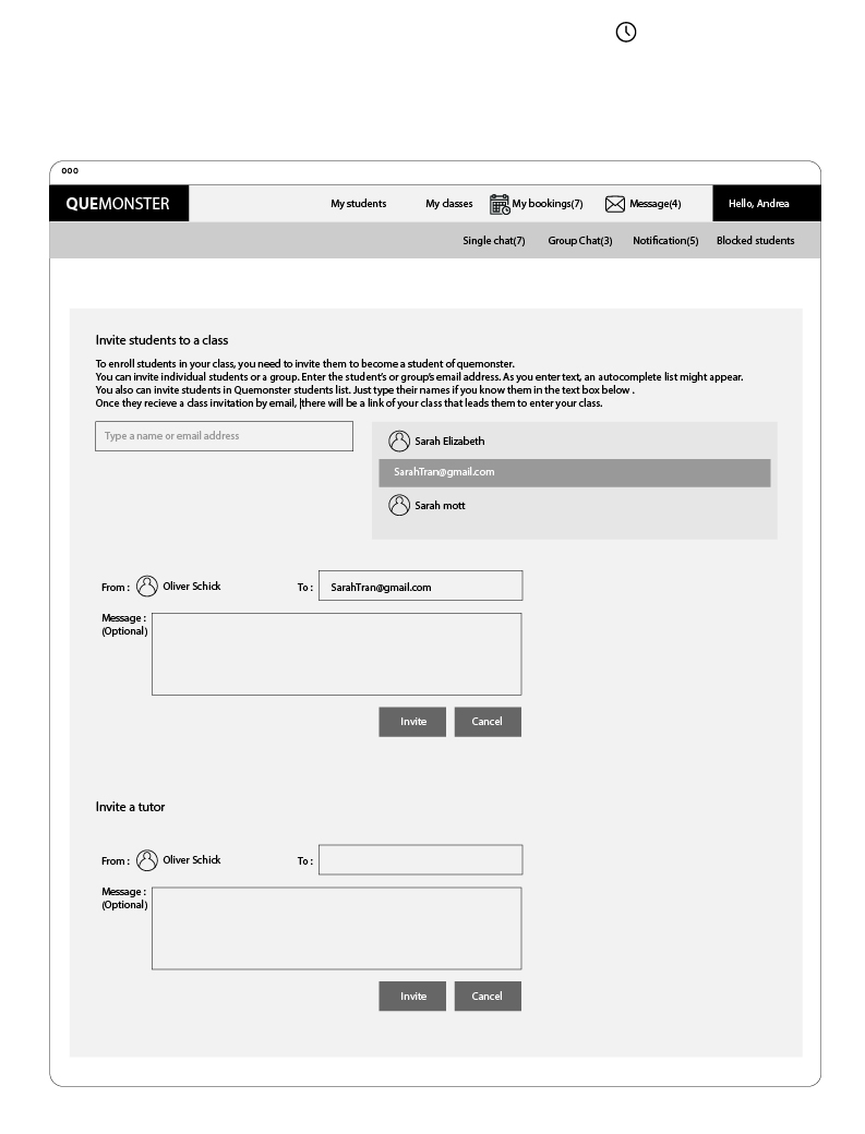
The Find a Tutor experience was designed in two states — before and after authentication — progressively revealing booking actions as users log in. This reduced barrier to discovery while protecting the transaction flow from unauthenticated abuse.
08 — 2026 Redesign Concept
Eight years later, I'm revisiting this platform — this time with AI as a collaborator.
What would Quemonster look like if designed from scratch today?
View 2026 Redesign Concept →